Ads Post 9/11
Image A

factsofisrael.com


Image B

sodahead.com
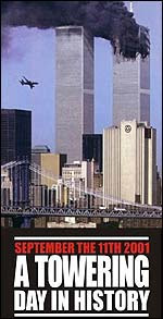
- My signs are communicating the tragedy that happened during the terrorist attack of 9/11.
- Image A shows more of the city and the smoke coming out of the building with the second plane getting close. Image B shows the building and the two flags that shows that the U.S. united no matter what.
- My eye would be drawn to image B more because of the flag and phrase "united we stand.''
Political Signs
Image A

bwarrenphoto.wordpress.com
Image B

politico.com
- My signs are communicating the election of obama as president.
- Image A is more of a sign to the people telling them no matter what they do their vote will go to obama. Image A is a sign supporting obama in the election.
- Image B will call my attention more because it's simple and short.
CD Cover
Image A

tower.com
Image B

seekacover.com
- My signs are both covers of a cd of two different bands.
- Image A is in all white and all the members are sitting down and it looks more calm and simple. Image B the members look more happy and energetic.
- I would pay attention more to image B since it looks more simple but interesting.
screwattack.com
Image B

candyaddict.com

- The wrappers are communicating the candies and their flavors.
- Image A are square with different colored wrappers and image B is red with many colored candies on it.
- Image B seems more interesting since it has all the candy colors on the front.
Shoe Company Ads
Image A

studentpages.ctd.northwestern.edu
Image B
typophile.com
- The images are brands of shoes with the logo.
- Image A has a big star with writing around it and image B is more simple by having the name and then the logo in red so it stands out.
- My eyes would be drawn more on Image B since the logo stands out.
Coffee Shops
Image A

chugginmccoffee.com
Image B
bulmanrealestate.com
- My signs are communicating coffee and other drinks to the people, so they can go anytime they are in the mood for some.
- Image A is more simple and clear as the name says it all. It is written in white because with a black background it makes it stand out. Image B is more big and bold with a green that makes it catch the peoples attention.
- Image B would catch my eye first because it is in color witch makes it stand out more.


No comments:
Post a Comment