Friday, September 30, 2011

Assignment #6: Pablo Picasso Cubist Painting


Emotions

My Pablo Picasso work is named, Emotions, because of all the different colors and feelings it portrays. In my image I tried to use some of the elements and feelings that the portraits at the museum expired me. I did it step by step trying to use as many elements as I can. The moods and emotions are what I portrayed the best. It was a good experience overall.
My personal portrait witch once was a normal camera shot is eight by ten inches. We used photo-shop to edit the original image to create all the effects on it. Some of the tools I used in photo-shop are the erase, paint, paint-brush, lasso tool, and the selection tool. The tools described weren’t the only ones that used I also worked with the distort and cutout witch helped me move my face around in a weird Picasso image. Even though I used more the tools on my image I still portrayed some effects on it.
Many of those tools helped me with the elements of design on my image witch helped me portrayed a different perspective of my image. The lines are what make up the whole image of my face. The color helps me portray feelings and emotions to my image. The shape was edited by photo-shop witch made my image abstract. The value made the colors portray different feelings to my piece. Further more the elements help me portray the interpret of the colors I used.
My image has many emotions to it but overall it has more of one color then others. At first I tried to use the blue period as an example to show dark and sad emotions. Then I realized that that was just not me. I wanted to show a different side of me so I decided to just start adding dark colors to my eyes. After I decided to add all different kind of variety of colors since I'm not just in one mood, just like any human I switch moods all the time. Overall I started putting different kinds of green since it means happy witch at the end of everything I will always be no matter what.
This is my most successful piece because I tried creating many emotions threw out it. Even though if I would have the chance to redo it all over again I would try to make my image look more abstract, so it can be more like Picasso's pieces. Overall all I liked this assignment witch let me expressed my self threw out the colors I portrayed.

Thursday, September 29, 2011

Assignment #5: Elements and Principles of Design


The basis of all design is the arrangement of the elements of a work of art, using the design principles. It is the bringing together of various components into one area and arranging them in such a way as to create a composition, layout or design that is both unified and pleasing to look at. For example every artist whether they realize it or not is familiar with the elements of design.

Directions: For each of the Elements of Designs, you will research online of an image that represents each of the elements. Cite and label each of the elements.


Line - an actual or implied mark, path, mass, or edge, where length is dominant
johngushue.typepad.co


Form - the mass of the shapes

brook72288.glogster.com


Texture - the structure and minute molding of a surface (rough, smooth, etc.)
ruralart.wordpress.com


Value - the degree of lightness or darkness of a given color

gscsart.wordpress.com


Color - a pigment

colored-thread.blogspot.com


Shape - any flat area bound by line, value, or color
curtvdl.com

Thursday, September 22, 2011

Assignment #4: Pablo Picasso Webquest

1. What is his full name? Pablo Diego José Francisco de Paula Juan Nepomuceno María de los Remedios Cipriano de la Santísima Trinidad Ruiz y Picasso (wikipedia.com)
2.When was he born?
25 October 1881 (wikipedia.com)
3. When did he die?
8 April 1973 (wikipedia.com)
4. Find out the names of his parents,brothers or sisters.
Parent's: Jose Ruiz Blasco and Maria Picasso Lopez Sister's:Concepción and Lola (www.sparknotes.com/biography/picasso/section1.html)
5. What were the names of Picasso´s wives or lovers? What were their nationalities?
Olga Stepanovna Khokhlova- United Kingdom, Marie-Thérèse Walter- France, Françoise Gilot- France (wikipedia.com)
6. What are his children and grandchildren´s names? Children's: Paul Joseph Picasso, Maria de la Concepcion Picasso, Claude Pierre Pablo Picasso, Anne Paloma Picasso (wikipedia.com)
7. Which topics did he paint about? He had two topics the blue period and rose period. (www.artchive.com/artchive/P/picasso.html)
8.Why did he go away from Spain?
Where did he live? He went away because of his talent. He lived with Max Jacob in Paris. (www.buzzle.com/articles/pablo-picasso-biography.html)
9. In which way did he influence the concept of painting? They classified by the various moods and periods of the time. (wikipedia.com)
10. Main events that influenced his life. The blue period, rose period, cubism, and guernica. (yahoo.com)


Find a Cubist Painting by Picasso (not a self portrait). Upload and site this image on your blog along with the name of the painting and date it was painted.

11. Describe some people, objects, and/or animals in his paintings(what they look like,the clothes they are wearing,their personality). It looks like a city around the beach area, with a use of sunset colors.
12. Is there anything special about the people´s faces or bodies? The forms are all in a quadratic way.

Thursday, September 8, 2011

Assignment #3- How do signs/ advertisement

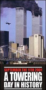
Ads Post 9/11
Image A
factsofisrael.com
Image B

sodahead.com
  1. My signs are communicating the tragedy that happened during the terrorist attack of 9/11.
  2. Image A shows more of the city and the smoke coming out of the building with the second plane getting close. Image B shows the building and the two flags that shows that the U.S. united no matter what.
  3. My eye would be drawn to image B more because of the flag and phrase "united we stand.''

Political Signs
Image A
bwarrenphoto.wordpress.com
Image B
politico.com
  1. My signs are communicating the election of obama as president.
  2. Image A is more of a sign to the people telling them no matter what they do their vote will go to obama. Image A is a sign supporting obama in the election.
  3. Image B will call my attention more because it's simple and short.
CD Cover
Image A
tower.com
Image B
seekacover.com
  1. My signs are both covers of a cd of two different bands.
  2. Image A is in all white and all the members are sitting down and it looks more calm and simple. Image B the members look more happy and energetic.
  3. I would pay attention more to image B since it looks more simple but interesting.
Candy Wrapper
Image A
screwattack.com
Image B

candyaddict.com
  1. The wrappers are communicating the candies and their flavors.
  2. Image A are square with different colored wrappers and image B is red with many colored candies on it.
  3. Image B seems more interesting since it has all the candy colors on the front.
Shoe Company Ads
Image A
studentpages.ctd.northwestern.edu
Image B
typophile.com
  1. The images are brands of shoes with the logo.
  2. Image A has a big star with writing around it and image B is more simple by having the name and then the logo in red so it stands out.
  3. My eyes would be drawn more on Image B since the logo stands out.
Coffee Shops
Image A
chugginmccoffee.com
Image B
bulmanrealestate.com
  1. My signs are communicating coffee and other drinks to the people, so they can go anytime they are in the mood for some.
  2. Image A is more simple and clear as the name says it all. It is written in white because with a black background it makes it stand out. Image B is more big and bold with a green that makes it catch the peoples attention.
  3. Image B would catch my eye first because it is in color witch makes it stand out more.